A few cutting remarks–USB charging station part 3

In our previous episode, we had just finished cutting the hub portion of the station.

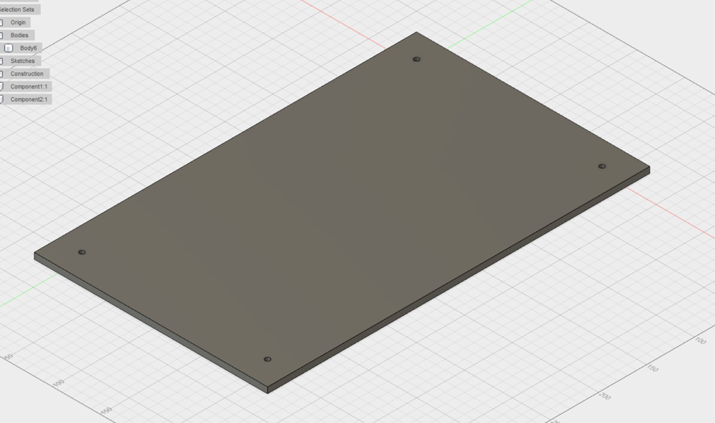
Now, it’s time to cut the remaining parts. I started by cutting the biggest part – the base. It’s about 8″ x 10″, and it has 17 slots in it and 4 holes, and each of those need to be cut in two passes. I decided to cut all the interior holes first in two passes, and then cut the outline. So, I started at the bottom and cut about 13 slots, and then I found that there were four slots missing.

When somebody added shelves to the design, he forgot to do the cut operation with the new shelves, so there were no holes there. Which means that the design needs to be redone, and since shaper doesn’t support an “update my design” operation, I had to abandon that section, though I did manage to cut a shelve out of it so it wasn’t a total loss.

The rest of the cutting was pretty repetitive. The shaper mostly worked okay, though it crashed a number of times and hung a few times as well. The back has 7 holes and a bunch of tabs and the shaper crashed on the last cut. Then I rebooted and found that both the workspace and the placement information is stored in non-volatile memory, so as long as the crash doesn’t damage your workpiece, you can continue.

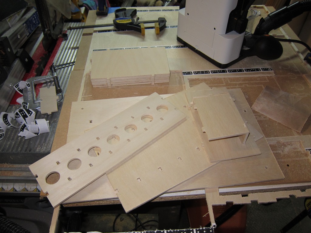
Eventually, I finished cutting all the pieces, and started cleaning them up:

IMG_9176

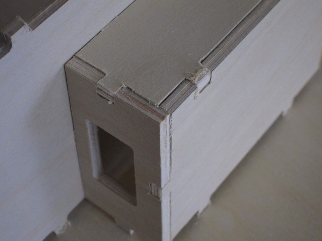
The shaper uses an upcut spiral bit so that it can easily pull the sawdust out; that cuts well, but leaves a fuzzy edge to the cut. I tried an offset technique where you do the initial cut a bit to the outside of the final line and the second cut right on the line, but the results weren’t any better. I’m going to explore whether a nicer bit would give a better result, but the result here is really worse than it looks. A couple of minutes with some 220 grit sandpaper and it cleans up nicely.

IMG_9180

A bit more time for cleanup, and I had a bit pile of parts:

IMG_9181

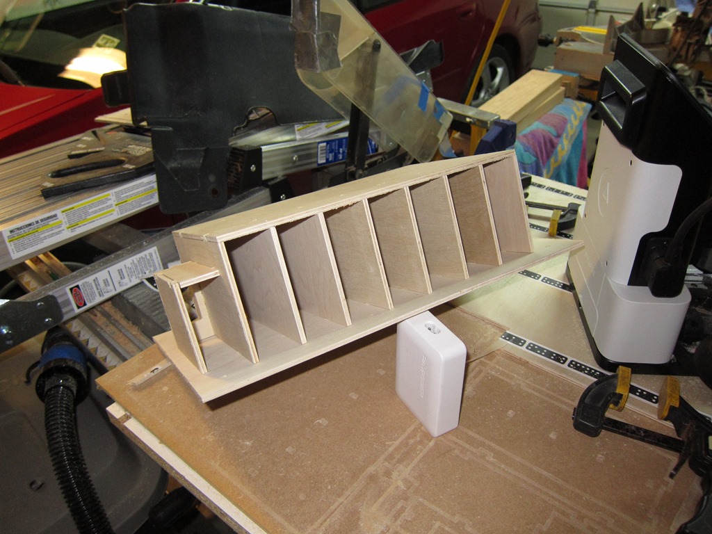
So, is this going to actually work, or was all that effort for naught?

Well, guess what?

IMG_9182

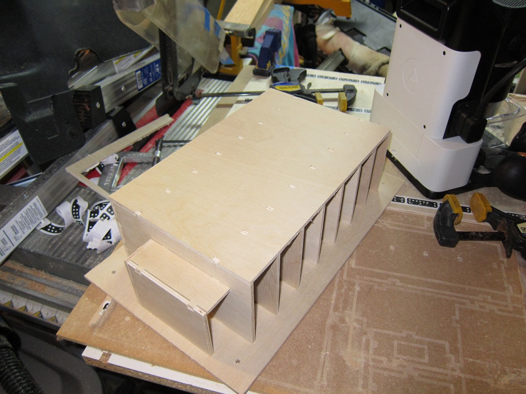
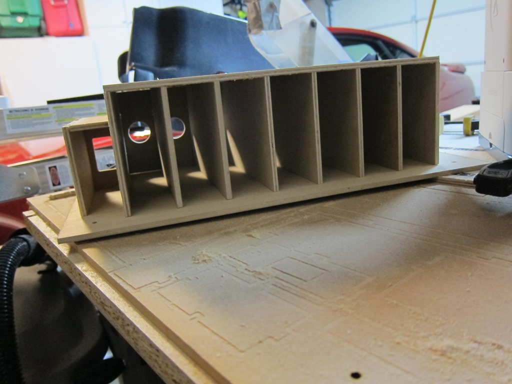
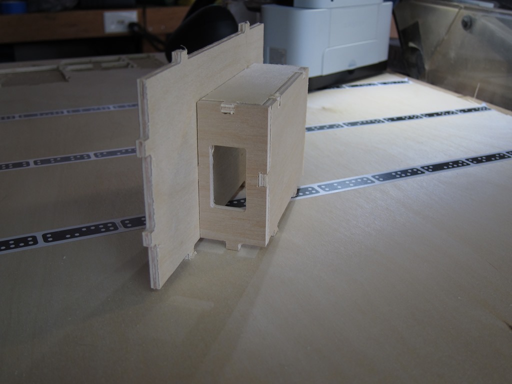
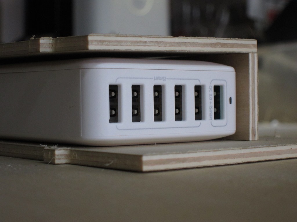
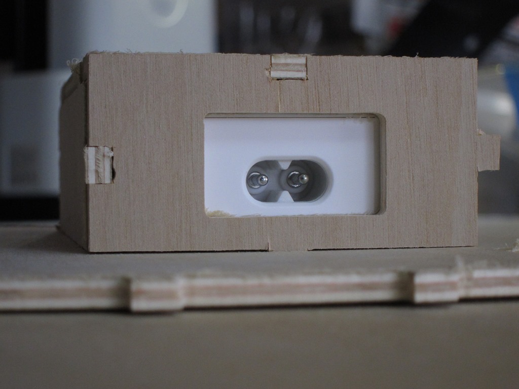
The fit of the tabs was very nice and it looks pretty good even without any glue to hold the parts together. Success!

IMG_9183IMG_9185

Next up is to look at all the joints and do a bit more tuning on the fit, especially on the hub holder in the left of the last picture.


Givin’ the dog a bone–USB charging station part 2

One of the realities of doing CAD work is that the real world sometimes intrudes…

Your laser cutter – for example – is limited to cutting a given size of material, and only in one plane. And it isn’t a perfectly thin cut, there is a little width to the laser beam.

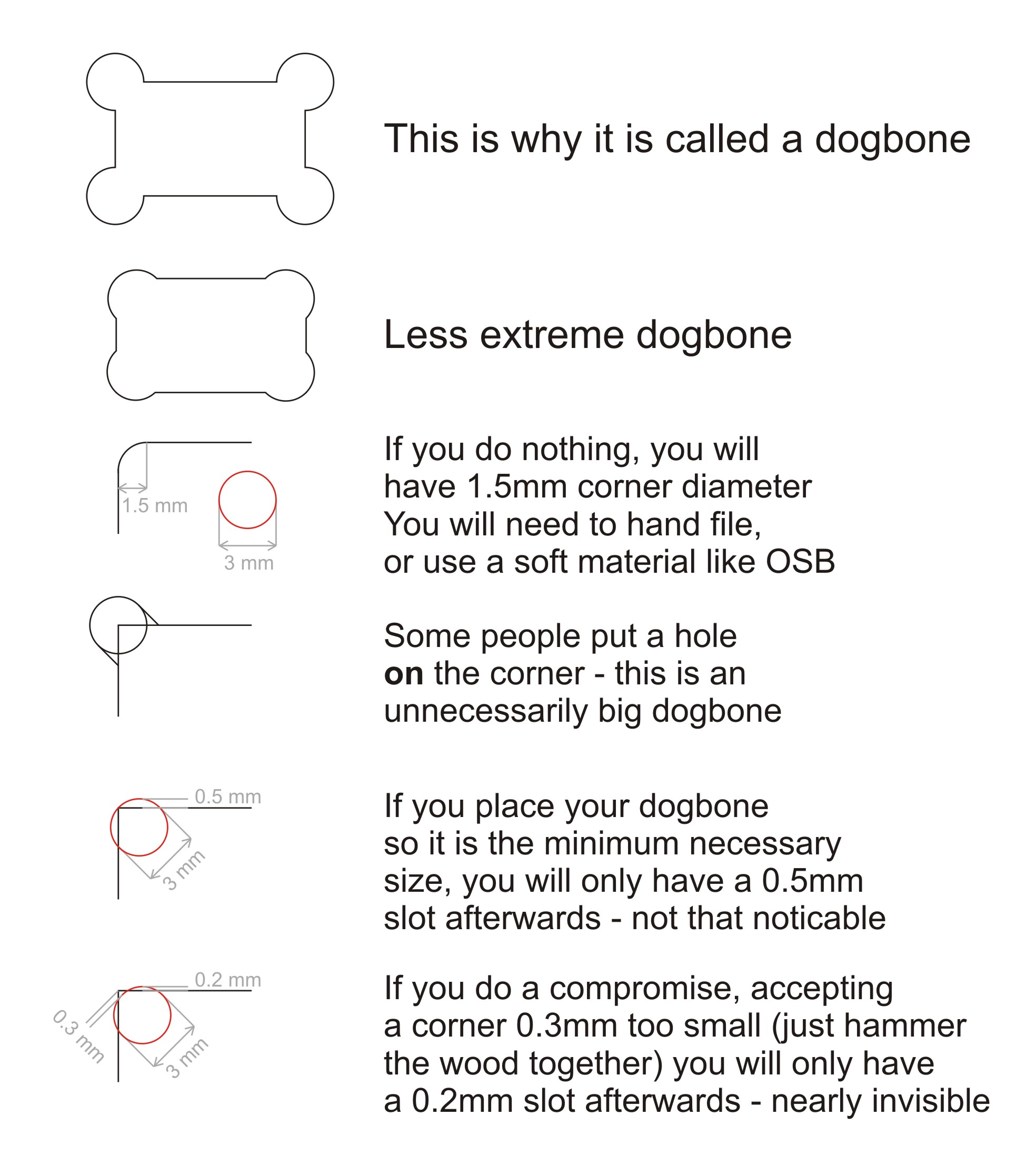
For router-based machining, one of the problems is that the cutter is round, and often the cuts you would like to make are square. Here’s an example:

Image result for cnc dog bones

The part on the left is what you designed, and the part on the right is what you got when you cut it. There are a few approaches to deal with this; you can cut the corners out with a knife or saw, you can just pound the parts together and hope the material yields, or you can change your design so that the corners are cut out. It looks like this:

Image result for cnc dog bone examples

Hence the name “dog bone”. With the Shaper, there are a few ways to do this; you can either modify your design to include the dog bones, or you can do them on the tool, one at a time, kind of by hand. Since there are hundreds in this design, doing them on the tool did not seem very exciting.

There is an add-in for Fusion 360 that does dog bones, so I installed it and tried it on a few designs. Like lots of freeware, it’s a bit challenging; you either have to pick every corner where you want the dog bone, or you can let it pick the corners that need to be modified but this only works if the corners are vertical.

Oh, and it takes a long time. A *long* time. Like 5 minutes for a panel with just a few cuts if you mark them by hand, or 20+ minutes for one with lots of holes (19) where it figures out which corners to modify. This is made much more annoying because Fusion 360 does something that I thought wasn’t supposed to be allowed under Windows UI guidelines any more; the status bar that it shows brings the window to the foreground and selects it. Since this is happening about every second, you can’t do anything else on your computer while the dog-boneification process is underway. Which kindof gets in the way of making good progress, since you need to go and do something else.

About this time I needed to get some wood for the shelf, and I needed to know how much and how I would arrange it the cut pieces on the board. I found this tutorial to be very useful in understanding how to do that, and ended up with a nice layout on a 24” x 48” sheet that used a bit more more than half of the space.

Went to add the dogbones by selecting all 13 pieces in the and kicking off the add-in. An hour later it was still running. Two hours later is was still running, much more slowly. Left it overnight and came back to the autodesk crash dialog.

About this time I was really thinking of just using the Glowforge and forgetting about dogbones, but the whole point was to use the shaper, so I pressed on.

Went out for lunch, picked up some stock (birch plywood that was 4.7mm thick), rolled back to my 3-d layout, set the thickness of the stock, and went through and did each of the dogbones by hand-selecting each corner. After that was done, I ran the Fusion 360 plug-in for the Shaper Origin, which generated SVG files that I uploaded to their website (you can use a USB key if you’d rather). I was going to do the bottom part of the design; the last wide shelf and then the pieces that hang the hub underneath that, four pieces in total.


image

At some point, Fusion lost the material selection for the one piece, and I was too lazy to fix it.

IMG_9171

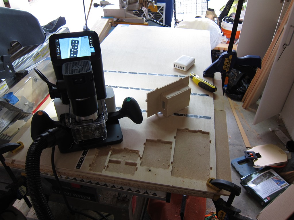
Here is the setup. Sitting on the router table portion of my BT3000 table saw, I have an extra ikea shelf (melamine and very flat), a sacrificial piece of MDF on top of that (you need to cut just through the material), and then the birch plywood on top (that piece was about $8). Across the wood you can see the “shaper tape”; this is how the vision system on the router knows where it is. The basic process to cut is:

  1. Move the router around so that it locates all of the domino-shaped shapes on the shaper tape.
  2. Load a design (in this case, from the online pieces I uploaded)
  3. Set the cut parameters (the size of the cutter you have in the router (1/8” in this case), how deep you want to cut on this pass (I did two passes, one at 0.125” and one at 0.2”)
  4. Do a “z – touch” so that the router knows where the top of the material is and can therefore judge depth.
  5. Move the router so that the line you want to cut is inside the circle.
  6. Turn the router on (using the physical switch on the head)
  7. Press the cut button (green button on the right handle), and wait for the bit to plunge into the work.
  8. Navigate the router around the cut.
  9. Press the retract button (orange button on the left handle), and wait for it to retract.

At that point, you can move to another cut that needs to be made or change parameters and recut the same line (deeper, for example).

This worked really well, except for two issues. The first was that on my second cut, something went wrong, and on the cut, the router plunged the bit as deep as it could and then the software crashed (you can see the burned hole near the bottom of the workpiece). I had to turn off the router, pull it carefully out, and cycle the power on the shaper to get back. The second was my fault; I cut all the way through an outline before forgetting that the piece I cut had a cutout. Oh, and the software crashed again when it was just sitting there; the image on the display is a static one before I moved it to make the picture nicer.

And the result is…

IMG_9172

IMG_9173

What do we see? Well, the first thing you’ll notice is that there is a lot of fuzziness on some of the cuts. The shaper uses an upcut bit, so that’s pretty common. The fix is to do the first cut at a bit of an offset back from the line and then do the final cut without the offset. Overall, the lines look really straight, which is remarkable given that a human is moving the router around.

What else do we see? Well, the joints don’t look very good, and there is a distinct lack of dogbones on them.

It turns out that I outsmarted myself. One of the tricks with dogbones in wood is to set the cutter size slightly smaller than the actual size of the cutter; that makes the dogbone a bit smaller but it still works since the wood has a little give to it. But… the Shaper knows the size of the cut you are asking it to do and the size of the cutter, so it just avoids cutting the dogbone path. I cut them by hand with a utility knife, but I was short of time so this is the result I got.

Finally, a couple of action shots with the hub in place:

IMG_9174

IMG_9175

Up next is to redo the dogbones for the remaining pieces *again*, and the cut them using the offset to see if I can get nicer joints.


Fusion 360: USB Charging station part 1

With a new Shaper Origin joining my Glowforge in the workshop, I decided it was finally time to break down and learn a real 3D modelling program. Autodesk provide a free year’s subscription to Fusion 360 and it looks like I can keep using it for hobby use, so I decided to learn it.

It took a few days, but I finally understand what I’m doing and can make decent progress. The really cool part about fusion is that your design is created from a series of steps and that series of steps is preserved in a timeline; if you discover that you made a mistake in how you defined a shape (fusion calls them “bodies”) two hours ago, you can go back to that step in the timeline and either modify the step that is there or add in a new one. This is a hugely powerful paradigm once you get used to it. It also lets you define parameters such as the width or height of a design, and when you change them it walks through all the steps and updates things. Or, you can say that you want to do a project in 1/4” plywood, but when you measure it it turns out to be actually 0.23” thick.

After watching a few tutorials, I decided I needed to do a project for the shaper origin, and that project would be a USB charging station to go in our walk-in closet. We have a shelf with predrilled 5mm holes that I am going to mount the charging station on.

The first step was to order a hub, and I picked up a RavPower Nexus 6 charger; it will spread 60 watts of power across 6 ports.

I did two different designs before I settled on one that I liked.

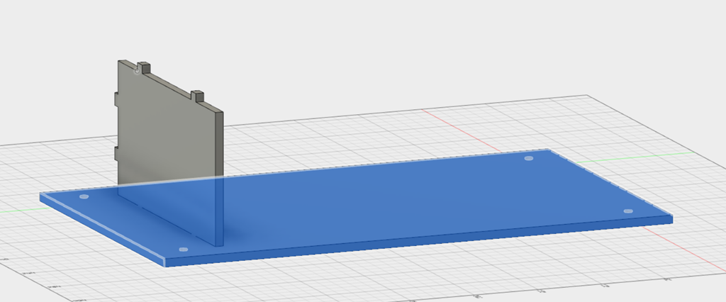
I started with four holes that should line up with the holes in the cabinet side:

image

Basically, the location of the holes is constrained by the measurements, and then the rectangle around it gives a given border.

The first shelf is added, along with tabs that will connect it to the other components. To get these views I’m rewinding the timeline to show what the design was at a certain point of time.

image

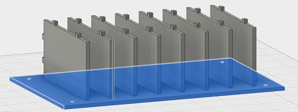
Now it’s time to duplicate the shelves.

image

A singled command called “pattern” did that; I selected a 1×8 pattern and the offset between each of the shelves.

A view from the back farther along:

image

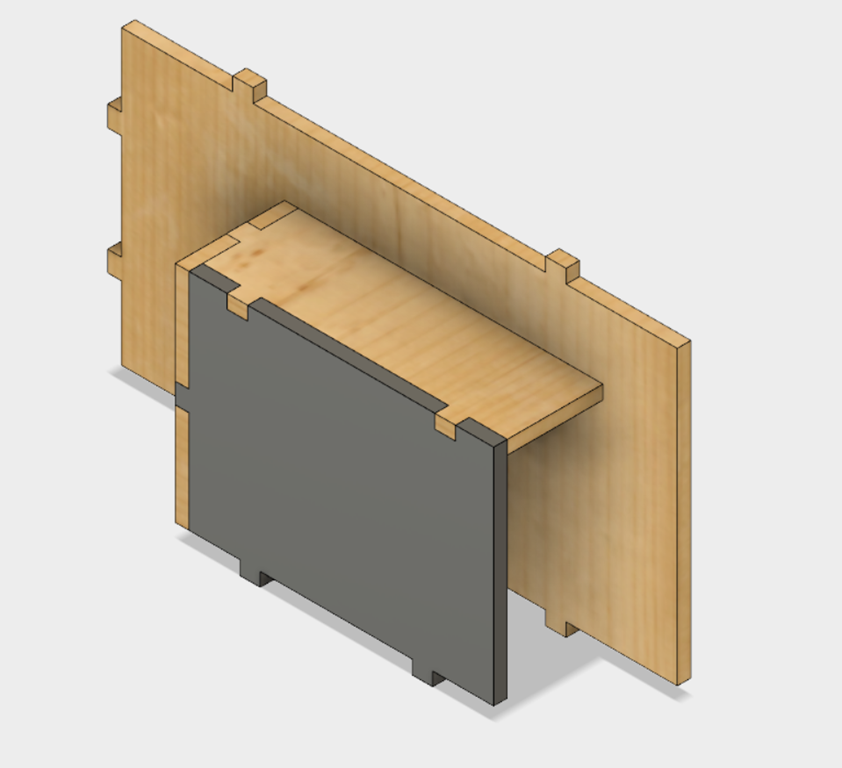
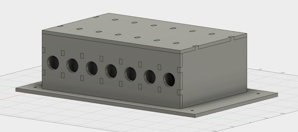
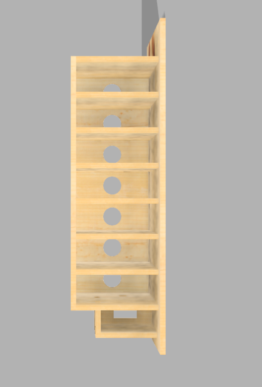
I added a top and a back to the shelves. There are now a series of cubbies which is where the devices to be charged will rest. There are holes in the top and back where the tabs from the shelves will stick through, and holes in the back for the charging cables. This is done by subtraction one body from another, using the “cut” operation.

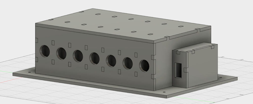
The section for shelves is completed. Now we need a spot for the usb hub. It will live in a box under the shelves, with a hole in the back for the power cord. The size of the hub was measured with a set of calipers, and then I entered it directly as a parameter for the design.

image

It looks like I perfectly sized the base for what I wanted, but in reality I did the shelves and usb hub box and then went back and changed the number of pins that the design covered.

The reasons that the tool is called “Fusion” is that it is a combination of design, rendering, and analysis tools. Since it’s going to be made out of wood, here’s a nice render of the result done in pine:

image

Basically the hub lives at the bottom, the wires from the hub go out the back through the bottom cubby, and then back through the individual cubby holes. The cubby bottoms will have felt in the bottom, which I’m sure I could define if I wanted to.

To build this, there are different ways to proceed. Shaper provides an add-in that lets me select on component and export it as an SVG that the tool will understand. There are 7 parts that are unique, and then 7 shelves that are identical.

I’ll write more when I’ve had a chance to get some material and do some cutting. I’m going to start with 1/4” plywood and use the shaper, but I could also use the glowforge to make this from as well.

With a bill of materials add-in, I can get an export that I can turn into a parts list. If everything fit perfectly, it would take 2.68 square feet for the whole thing, so if I go with a 2×2 piece, things will *probably* work out.

image

More when I have some wood cut. My plan is to start with a cheap wood (maybe mdf) first.


WPC Driver board Upgrade

I finished the upgrade of my WPC driver board today. It was fairly simple despite Williams using a crappy circuit design; instead of using vias to carry power from one side of the board to the other, they rely on component leads to do that, presumably to save cost.

If you do this yourself, after you remove the component make sure to tin the ring on the component side with solder and overdo the amount of solder you use if you can’t see the component side; I had to redo several of the big capacitors because they had great solder joints on the bottom but not enough solder to grab onto the other side. So, on those components, jam more solder in there than you would normally do, and I also recommend grabbing the schematics, an ohmmeter, and checking for continuity through the hole.

WCS Power Driver Board Voltages

I measured the board voltage for future reference, both with only the input power connected to the board and the game in attract mode, using a quality Fluke voltmeter.

AC is measured to look for poor filtering by the large capacitors on the board; as the capacitors degrade there will be more AC present on the voltages.

Test point Input DC Input AC Attract DC Attract AC Description
TP1 15.83 0.002 13.8 0.1 +12V filtered but not regulated
TP2 5.02 0 5.01 0 +5V regulated Digital supply
TP3 12.03 0 11.7 0 +12V regulated digital supply
TP4 0.393 0.6 3.80 0.06 zero cross
TP5 Board ground
TP6 77 0 76.2 0 +50V for solenoids, flippers
TP7 22.26 0.003 21.8 0.01 +20v flash lamps
TP8 18.52 0 13.9 – 15.1 0 – 2 +18 to lamp columns


When and where do I burn fat and carbs?

I’ve been having a repeated online discussion about fat and carbohydrate burning, and therefore decided to write a post that goes into it in detail.

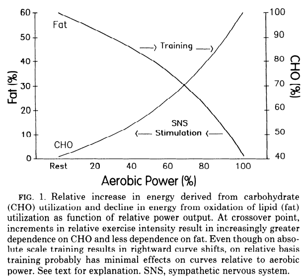
There is a very common – perhaps even famous – graph in exercise physiology that looks like this:

Fat-and-CHO-use-with-ex-intensity

The explanation that goes along with says that at low intensities, our bodies get most of their energy from burning fat, but that as we get to higher intensities, the percentage gradually changes, until at the top intensities, we get pretty much all of our energy from carbohydrate (CHO in the diagram). This explanation led to a lot of advice; there was a lot of advice that people should exercise at low intensities because that is where they would burn the most fat, and then contrary advice that said that while the fat burn was a smaller percentage at higher intensities, it was larger in absolute values and therefore to burn more fat you should work out at higher intensities.

What this discussions missed was something very simple…

This graph cannot be true for the vast majority of the population.

And it is wrong for a very simple reason; our bodies adapt their energy sources based on the diets we eat.

To illustrate why, let me discuss two different people:

  • Chris eats a very low fat diet of about 2000 calories per day; of these, she gets 10% from fat, 25% from protein, and 65% from carbohydrates.
  • Felicia eats a low carb diet of about 2000 calories per day, of these, she gets 65% from fat, 25% from protein, and 10% from carbohydrates.
  • Both have stable weight and body composition; they are neither gaining nor losing weight.

    Let’s explore how the graph might relate to Chris, starting at the left side. If Chris is getting 80% of her calories from fat, then she needs 2000 * 0.8 = 1600 calories a day from fat. But she is only eating about 200 calories per day in fat and her body composition is stable, so there is no place that she could be getting an extra 1400 calories a day in fat. If she had that big of a fat deficit, she would be losing about 2.7 pounds a week (1400 * 7 = 9800 calories / 3600 is about 2.7 pounds). Further, if she is only getting 20% of her calories from carbs, that would be 400 calories per day, but she is eating 1300 calories per day, so she has an extra 900 calories per day of carbs. Those carbs need to go someplace, but the only big carb sink in our bodies is to store those calories as fat.

    This graph simply cannot be true for Chris. Given that she has a stable weight and body composition, the energy she gets has to come in the same proportions as the food that she eats.

    On to Felicia. The left side of the graph can work okay for her; she eats a lot of fat calories and those could provide the bulk of her energy at rest. It doesn’t work well for her at the right side; she is only eating about 200 calories per day of carbs, and let’s say that she goes on a one-hour run every day at moderate intensity. On that one-hour run, she burns around 500 calories, and half is 250 calories from carbs. But she is only eating 200 calories per day of carbs, and there are other tissues (the brain and red blood cells) that need some glucose to survive, so she doesn’t eat enough carbs to make this graph a reality.

    In neither of these cases is the graph a realistic depiction of what is going on. So what really happens?

    Well, here’s some research from back in 1997 where they played around with the amount of fat in the diet, and this is what they found:

    “The results of the present study show that, in situations in which energy balance is reached, substrate oxidation can be adjusted to substrate intake. After 7 d(ays) on a high-fat diet, fat oxidation was, on average, equal to fat intake.”  (Discussion section, first paragraph)

    In other words, the amount of fat that the subjects burned adjusted to be the same as the amount of fat the subjects ate.

    Or this study. From the abstract:

    Diet composition did not affect total daily energy expenditure but did affect daily nutrient oxidation by rapidly shifting substrate oxidation to more closely reflect the composition of the diet.

    The same result as the other study. Our bodies adapt to burn the mixture of food that we provide it.

    So, what does the graph really look like?

    Here is some data gathered from testing a couple of athletes; the full article is here. Basically, you put them through a VO2max testing protocol, and you measure their fat and carbohydrate metabolism along the way.

    Here is the first athlete:

    This is athlete burns a small amount of fat even at very low intensities, and it only gets worse from there. Based on what I wrote about adaptation, what kind of diet is this athlete on?

    Yes, it’s a high carb one; in fact, the athlete said that he had a sweet tooth and ate lots of sugar. Even at rest, he is burning a lot of carbs, and it only gets higher from there. As part of the study, this athlete modified his diet to reduce the amount of carbs and increase the amount of fat, by minimizing sugar and eating rice/break/pasta/potatoes only once or twice a week. After 10 weeks of training on the new diet, he looked like this:

    He now gets a lot more energy from fat across the board, though he still gets a lot of calories from carbs. His body adapted to use the kind of diet that he now eats.

    Here’s a second athlete:

    What kind of diet was he on? Well, there’s no description of that in the linked article, but my guess is it’s a pretty standard athlete diet, and he doesn’t eat a lot of sugar. He is decent at burning fat, burning 40-50% over most intensities, but most of his energy still comes from carbs.

    He switched his diet to take out grains and fruit (a break from the study goal, which was a low-carb ketogenic diet), and trained for 10 weeks. Here’s his second graph:

    He now burns a ton of fat *everywhere*, regardless of intensity. Even at 4.5 watts per kilogram – a very high energy output – the fat and carbohydrate burn are about equal. The contrast of this graph to the first athlete’s “before” graph is huge.

    Note that none of these graphs look like the one at the beginning of this post; what we see is that the poor fat burners stay poor fat burners as intensity rises, and the same for the good fat burners. We do see that at the high end fat burning goes down and carb burning goes up, but the overall graph shape doesn’t look like what we are told it should be.

    So, where does the graph come from? Not being in the field and having not researched this thoroughly, I do not have a definitive answer, but following a reference led to this article which has this graph in it:

    image

    Digging a bit into the article, it is about how training effects the relative use of fats and carbs during exercise. I followed a few of the cited articles, but did not find the ones I wanted for free. I *did* find that the article cited Phinney’s early research on exercise and ketosis, which to me implies that the author knew about the adaptation due to different diets.

    Anyway, I didn’t find any support for the idea that this graph was intended to be a representation of different sources of fuel *in general*.

    So how do I burn more fat?

    The whole concept of a fat burning zone and different intensities is not supported by studies. What *is* supported is that humans adapt to be good at burning the kind of fuel that they have available over time after a short adjustment period.

    If you want to burn more fat *in general*, the answer is pretty simple; if you eat fewer carbohydrates – especially simple carbohydrates with high glycemic load – you will get better at burning fat during the day. Whether you lose weight will depend on your overall energy balance – you will still need to eat fewer calories than you burn to lose weight – but that puts you in a better position to be burning fat.

    If you want to burn more fat during exercise – which can be a great way to burn fat – there are a few approaches:

    1. You can change your base diet to eat fewer carbohydrates – especially the simple ones.
    2. You can reduce the amount of carbohydrate that you take in during exercise. If your exercise is of a long enough duration, you will burn off enough carbohydrate to encourage your body to shift to better fat metabolism.
    3. You can exercise fasted. You start in your best fat-burning state, so the exercise will have more of an effect on changing how your body generates energy.

    You can mix and match these at will to see which one works the best for you.

    There are a few caveats when it comes to exercise:

    • To become a better fat burner, we need to train as if we were already a better fat burner – without as much available carbohydrate – and if we train for a significant duration, we can exhaust our carbohydrate stores and bonk. So, my advice is to have a source of carbs with you in case you start getting hungry or feeling really tired, and if this happens, to have a few of those carbs.

    • When you start, your body is poor at fueling your exercise from fat. That means that you are going to have less power overall than you are used to. If you continue to push hard, you push your metabolism over to burning more carbs, losing the adaptation that you are trying to get. So, you will need to slow down to get the best adaptation, and remember that it’s going to take a little while (ie weeks) to become decently adapted.


    Workshop finishing update

    I’ve done a fair bit of work to update the workshop, but have been terrible at taking pictures. So, here’s the current state:

    IMG_9073

    IMG_9074

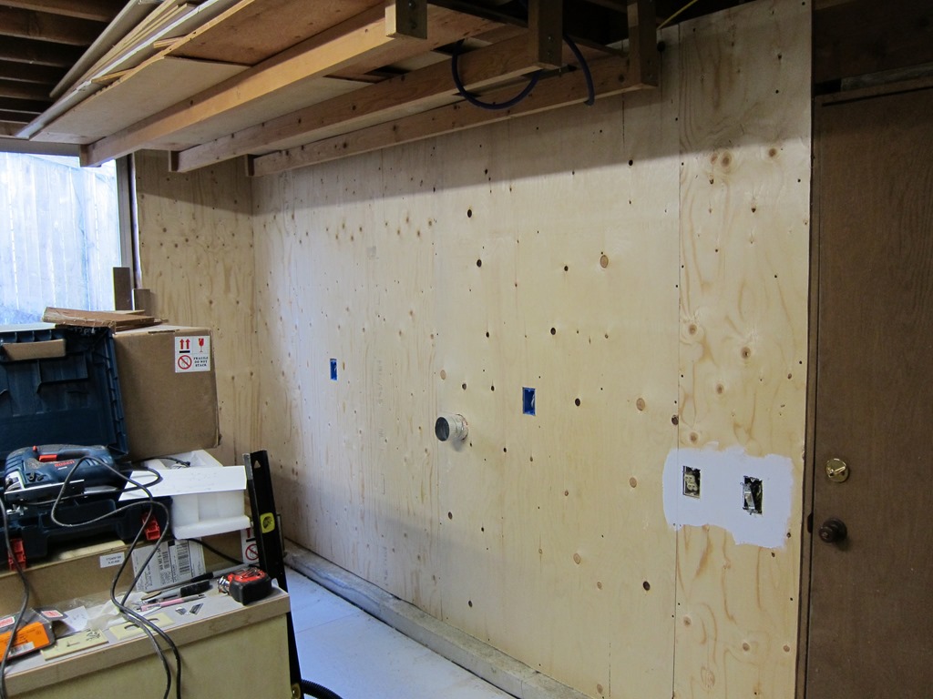
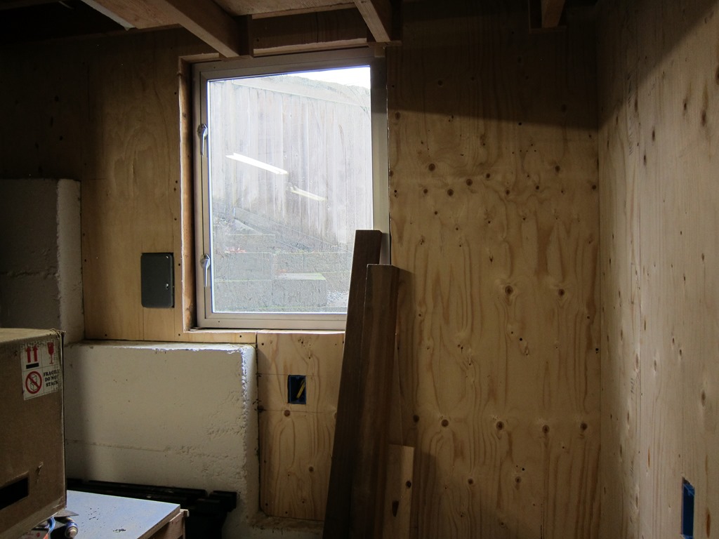
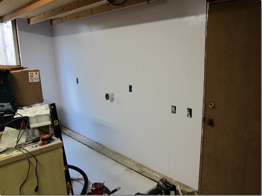
    There’s a pretty new window in the bottom picture to bring some natural light into the space. The walls are all insulated with Roxul rock wool, which was a significant pain in the ass because the long wall has studs 12” on center and it doesn’t come in those widths, so I had to take 23” batts and split them. Ick. There are three new boxes for outlets, but the circuits aren’t hooked up yet. The wall is 1/2” CDX plywood, chosen because I want to have a wall I can hang things on.

    IMG_9075

    Here is a pretty picture with the wall painted white to make the whole room lighter.

    Up next will be doing the electrical, moving the cabinets back, and working on the rest of the room.


    WPC driver board issues

    My WCS 1994 is having some issues; the DMD display is showing static and now the game is behaving strangely.

    I’ve been using the guide here, but I’d like to share some other data I’ve gathered since I didn’t find it elsewhere.


    Test point Working DC Working AC Problem DC Problem AC Description
    TP1 14.7 0.63 13.5 0.08 +12V filtered but not regulated
    TP2 4.93 0.01 4.97 0.001 +5V regulated Digital supply
    TP3 11.92 0.008 0.758 0.122 +12V regulated digital supply
    TP4 0.37 0.63 3.62 0.06 +50V filtered
    TP5 0.03 Board ground
    TP6 73.2 0.2 – 0.8 75.1 0.01 +50V for solenoids, flippers
    TP7 21.7 0.09 21.6 0.04 +20v flash lamps
    TP8 15-17 0.2 (ish) 11-14 0.8 (ish) +18 to lamp columns

    “Working” values come from my Twilight Zone (working), while “Problem” ones come from my WCS (not working).

    What can we tell from this?

    Well, a few things. The obvious issue is TP3; it is less than 1 volt when it should be around 12 volts, and it’s letting a lot of AC through at all.

    Time to pull out the schematics.

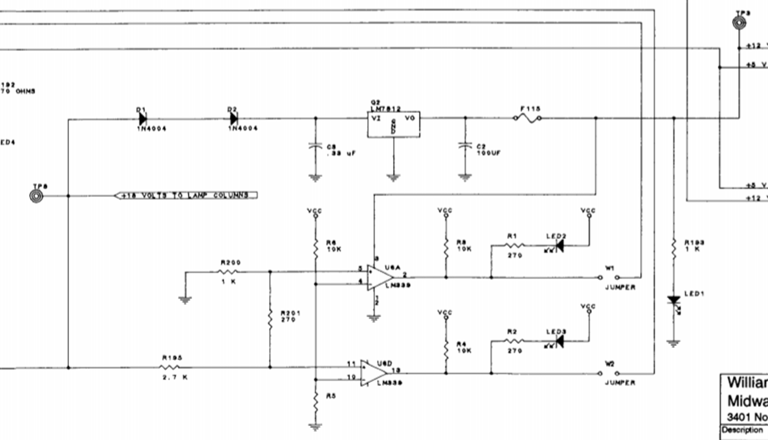
    image

    Sorry, that was the best image I could pull from a PDF; the paper version isn’t much better.

    Basically, we have power coming in from the left side, which should be a nice healthy 18volts (measured at TP8). It goes through two series diodes that will drop the input by a little over a volt, and then it goes to an absolutely-standard 78xx linear regulator circuit; a capacitor on the input, a 7812 (for 12volts) and a capacitor at the output. 78xx regulators are pretty robust, so let’s see if we’re using it correctly…

    Like most linear regulators, the 78xx series has some limitations around input voltage; it requires about 2 volts of headroom to be able to give us the output voltage, so we should be looking for 14 volts coming in. We have 11-14 volts – it fluctuates because the lights are flashing in attract mode. That 11-14 volts isn’t enough to consistently give us enough voltage for the 7812 to give us a nice 12 volts.

    So, we don’t have enough power coming in, so that is the problem, right? Well, not so fast. Based on what I know about the 78xx regulators, one would expect that if the voltage drops enough so that you don’t have a full 2 volts, you will see the output voltage slowly drop down.

    I pulled out a 7809 and hooked it up to my variable power supply, and found that this was mostly true; the dropout voltage was about 1.2 volts (two diode drops). That means I would expect that the 7812 would put out less voltage but something close to 12V.

    So, that suggests that we have two issues going on; we don’t have enough voltage coming in for the regulator to work and the regulator looks fried. That is supported by some data I had before this where the game was acting very weird and the voltage at TP3 was fluctuating all over the place. So, a new 7812, and it would be a good idea to replace the 1n4004 diodes and the electrolytic capacitors in this section at the same time, since this board is nearly 25 years old.

    Looking at the input voltages at T8, note that there is a decent AC component in the DC voltage – about 0.8 volts. Back to the schematics:

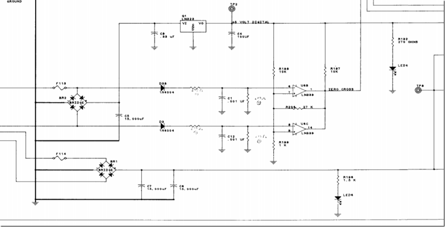
    image

    This is also really simple; we have AC from the transformer coming in, going through a full-wave rectifier, and then there are two honking big 15,000 uF electrolytic capacitors. As these capacitors age, they are going to lose some capacity and have an increased internal resistance; both of those make them worse at filtering, so it’s time to replace those as well. It’s possible that the AC that they are putting out ended up hastening the end of the 7812.

    It’s typical to replace both the capacitors and the bridges when the board is reworked, just to make sure, so I will probably do that.

    I am a little concerned by some of the values I see on my TZ board; there are some indications that the caps there need replacement as well. I’ll do the WCS and then compare it to the TZ one.


    The biochemistry of weight and nutrition–Part #1: Carbohydrates

    Back in May of 2017, I started a journey to learn more about how the biochemistry of weight works; how our bodies metabolism carbohydrates, protein, and fats, and how that influences our weight.

    When I started, I had a pretty simplistic view of how our bodies work.  I’m still only starting to have a functional understanding of the underlying biochemistry, but what I’ve found is that our bodies are very complex and fascinating systems shaped by the environment in which we evolved, and that if you understand the underlying biochemistry, things make more sense.

    So… This is my attempt to present a simplified view of the underlying biochemistry. If you want to learn more, I recommend starting with a copy of “Mark’s Basic Medical Biochemistry”, but I’ll caution you that the section on carbohydrate metabolism alone is around 84 pages, so it’s pretty dense. If you want a slightly lighter approach, you can try “Mark’s Essentials of Medical Biochemistry”, which is a bit shorter. In either case, read them and then find some YouTube videos that talk about the subject, and iterate on this process a few times.

    A few basic principles:

    Our bodies are adaptive systems

    If you’ve ever trained for an athletic event, you know that when you start training it’s really hard, but it gets easier over time as your body adapts, by making physical changes to your body. Our bodies also have an adaptive response to the kinds of foods that we eat, and that response can take time.

    Our bodies try to be energy efficient

    We evolved in an environment where food was not always plentiful, and our bodies generally attempt to be efficient and not waste any food calories.

    Reactions to diets vary significantly between individuals

    Genetics, age, sex, medical history, and activity level are all significant when considering how a specific person reacts to a specific diet. Or, to put it another way, one person may be able to remain healthy on a diet that would make somebody else very sick.


    Carbs

    I’m starting with carbs because their role is central to how your body reacts to the food that you eat. I’m going to talk about the different kinds of carbohydrates, how they are digested/absorbed, and how they are metabolized (used) by our bodies.

    The nomenclature around carbs is a bit confusing, but they break into four broad classes:

    Simple Sugars (aka “monosaccharides”)

    The simple sugars are the ones that aren’t broken down by our digestive systems to something simpler. Most people are familiar with fructose and glucose, and there is also galactose, which I’ll discuss more in a bit. There are also some rarer sugars and sugar alcohols that I’m ignoring for now.

    Compound Sugars (aka “Disaccharides”)

    “Di” meaning “two”, these are sugars that are compounds of two simple sugars.

  • Sucrose (aka “table sugar”) is a compound of one molecule of glucose and one molecule of fructose
  • Lactose (aka “milk sugar”) is a compound of one molecule of glucose and one molecule of galactose
  • Maltose (aka “malt sugar”) is a compound of two molecules of glucose.
  • The much maligned High Fructose Corn Syrup is not a compound sugar, but a mixture of simple sugars. It comes in different fructose/glucose ratios, with the most common one being 55% fructose, so it’s similar to sucrose in its underlying composition and effect on the body.

    Complex carbohydrates (aka “Oligosaccharides” and “Polysaccharides”)

    All of the complex carbohydrates are chains of simple sugars hooked together (“oligo” means “a few”, and “poly” means “a lot”).

    In this class we have ingredients like maltodextrin (a small chain of glucose molecules), or starches (big chains of glucose molecules).

    Cooked starches are easily broken down into their simple sugars by our digestion. Some raw starches – also known as “resistant starches” – are poorly digested in the small intestine, and digested by bacteria in the large intestine and converted to short-chain fatty acids, which are absorbed. I would call them “starches that don’t act like more familiar starches”.

    Undigestible carbohydrates (aka “fiber”)

    Humans don’t have the digestive equipment to extract energy from carbohydrates like cellulose, so they just pass through our systems.

    Carbohydrate absorption

    With the exception of resistant starches and fiber, all of the carbohydrates are broken down to glucose, fructose, or galactose by the digestive system before they enter the bloodstream. The rate at which they enter the bloodstream depends upon a number of factors. A refined sugar is more accessible than one that is bound up within fiber in a food, so it is absorbed faster. A sugar that is by itself is more accessible than one that is mixed in with fat and protein. Different sugars have different transport mechanisms to get them from the digestive system into the blood stream and therefore have different rates of absorption.

    But at the bottom, it’s glucose, fructose, or galactose. The sugars that you get from eating an apple aren’t chemically any different from those you get from a can of Coke. The two foods – if you can call a can of coke “food” – differ in the total amount of carbs, the ratios of different types of carbs, the rate at which the carbs are absorbed, and the non-sugar ingredients, but they both end up as simple sugars in your system.

    Complex carbohydrates also aren’t inherently different than simple sugars; they may not taste sweet, but they end up as simple sugars (typically glucose) when they are absorbed.

    Carbohydrate Metabolism

    Metabolism is all about what happens to the nutrient after it gets into our bloodstream. It turns out that the different simple sugars are processed very differently.

    I’m going to start with glucose metabolism.

    Glucose metabolism

    The amount of glucose in our blood – our blood glucose (or blood sugar) level – is one of the most important values for us as living organisms. Too little (aka “hypoglycemia”), and we get hungry, headachy, sleepy, confused, or worse. Too much (aka “hyperglycemia”), and we have other issues; a lot of our body’s systems do not work well with too little or too much blood glucose.

    Our bodies therefore have a system to keep blood sugar constant, and this is a high priority system; it is fair to say that “keep blood glucose within range” is Job One for our regulatory systems.

    Let’s say we ate a small plain bagel or drank a can of Coke. That’s going to send somewhere around 30 grams of glucose into our system. That is over 7 times the amount of glucose we normally have in our bloodstream, so we need a place to put the excess glucose, and biochemical system to pull the glucose out of the blood and put it in that storage place.

    Storing Glucose

    There are two different methods of storing glucose in our bodies.

    We can store it in our liver or our muscles as glycogen, a compound that is very close to glucose chemically. Glycogen is a little like a starch; it’s just a bunch of glucose molecules surrounding a protein known as glycogenin, and it’s quick and easy to get the glucose back out. The storage for glycogen is fairly limited; the muscles can store about 400 grams, and the liver can store about 100 grams, or 500 grams / 2000 calories total. If you have ever “hit the wall” or “bonked” during extended exercise, you’ve experienced what happens when you run out of liver glycogen.

    If your liver and muscle glycogen stores are already full, the excess glucose out of the blood needs to go somewhere else.

    There is only one other place for storing the excess energy that the glucose represents, and that is our fat stores. We tend to think of sugars and fats to be very different things – one is white and crystalline, and the other is oily or greasy – but they are both molecules made from carbon, oxygen, and hydrogen. The liver and fat cells can take in the excess glucose and convert it to fat, which is stored in our fat cells.

    The biochemistry to do this is built on a hormone that we have all heard of, insulin. When blood sugar is high, the pancreas releases insulin, which has 3 main effects our system:

    1. The muscles and liver increase their absorption of glucose to store as glycogen (assuming there is room to store it).
    2. The body turns off fat burning, so that current energy use will help use up glucose.
    3. The fat cells increase their absorption of glucose to store as fat.

    The speed at which glucose can be stored depends on where it is being stored; storing it as glycogen is quick, while storing it as fat is slow. Here’s an interesting chart from a study:

    Image result for insulin resistance glucose levels

    The subjects in this study had slept overnight, which had burned some of the glycogen in their stores. They then gave them one of three breakfasts:

    • A can of Coke
    • A service of instant oatmeal
    • 2 poached eggs.

    Both the Coke and the oatmeal have a lot of carbs, and the eggs have almost none.

    Then, they fed them a *second* breakfast of oatmeal – a lot of carbs – and measured their blood sugar over time.

    What they found was that if the first breakfast was eggs, the second breakfast had little effect on their blood glucose, because all of those carbs went straight back into filling up the glycogen stores. If the first breakfast had carbs, they had mostly refilled the glycogen stores already, and it therefore took quite a while to get the blood sugar back to normal. Which means that much of the second breakfast was stored as fat.

    These charts showed what happened with a healthy person – one that we would call “insulin sensitive”. The blood glucose gets back to normal.

    For some people, that doesn’t happen. There are different theories as to why it doesn’t happen; one is that the glycogen stores just get full, one is that the fat and liver cells can’t do the conversion to fat well, and there are others. Regardless, their glucose-absorbing cells become resistant to the effects of insulin, which we call “insulin resistance”. The first reaction of our bodies is to try harder by using more insulin, but this is an arms race that can eventually lead to problems in insulin production. Many people progress from insulin resistance to type II diabetes and metabolic syndrome.

    I want to stress here that insulin resistance and type II diabetes are about the abilities of our bodies to regulate blood glucose levels, they are not about weight. It is true that people who carry a lot of extra weight are more likely to have blood glucose issues, but there are obese people who have good blood glucose control, and – perhaps more surprisingly – there are thin or normal weight people who have insulin or type II diabetes. They have bodies that are not good at converting excess glucose to fat.

    That is why testing for blood glucose over time is important. Unfortunately, testing for blood glucose every day is intrusive and not something you can use with the general population, so for a long time all that was used was the blood glucose measured at one time, which is not a good predictor.

    Then a weird bit of biochemistry came to the rescue. It turns out that in our red blood cells, the hemoglobin that transports oxygen can become glycated – it can have a glucose molecule attached to it. The chance of that happening depends on the average amount of glucose in the blood; if you have a low average blood glucose, few of your hemoglobin molecules will be glycated, while if you have high average glucose, more will be glycated.

    And, it turns out that when red blood cells die, we can look at the hemoglobin and see how much was glycated, and therefore have a good idea the overall glucose levels, as a weighted average for the past few months. 

    The test to do this generates a value known as HbA1c, or simply A1c, and it’s the prime diagnostic measure for insulin resistance and type II diabetes.

    Low blood glucose

    Thankfully, this is a lot simpler.

    The reaction to low blood glucose is somewhat the opposite to high blood glucose. It is mediated by a hormone released by the pancreas known as glucagon, which has roughly the opposite effects as insulin:

  • The glycogen stored in the liver is converted back into glucose and released into the bloodstream (the glycogen in muscles can only be used locally; it cannot be released back into the bloodstream).
  • The body encourages the release and burning of fatty acids rather than carbohydrates.
  • If that is enough to raise the blood glucose, that everybody is happy. If the low blood glucose continues for longer – say for a few days – the body switches over to an alternate fueling approach known as “ketosis”, which involves the following changes:

  • The liver starts producing what are known as “ketone bodies”, which you can think of a glucose substitute for some of the body tissues; the brain can largely use ketone bodies for fuel, as can some muscles.
  • The muscle switch to burning more fat and less carbohydrate to produce energy. Like any exercise adaptation, this occurs over time.
  • The liver starts producing glucose from whatever it has lying around; it might be glycerol from fat metabolism or excess protein, or both. This is known as “gluconeogenesis”.
  • Together the switch to ketone bodies and the creation of new glucose is enough for the body to function normally without eating carbs. Adapting to this takes a couple of weeks for most individuals, though adapting to burn more fat during exercise takes much longer.

    Ketosis is a response whenever carbs are severely limited, whether it be a fast or a ketogenic diet. Ketosis is not an all-or-nothing response; a person on a relatively low-carb diet might be in ketosis overnight when their carb reserves get low and then switch out of it during the day when carbs are more available.

    And that is the story on glucose.

    Galactose metabolism

    Galactose metabolism is pretty much like glucose metabolism, except a trip to the liver is required to break the galactose molecule apart into two glucose molecules, which are either used by the liver or released into the bloodstream.

    Fructose metabolism

    Our body cannot metabolize fructose directly, so first it has to take a trip to the liver to be converted to something that is more useful.

    It ends up as one of three things:

  • Glucose, which is stored in the liver, converted to fat by the liver, or released into the blood stream.
  • Lactate, which can be used by other tissues
  • Triglycerides (ie fat).
  • There is considerable discussion around what the proportions are between those three products and what controls those proportions.

    Some researchers theorize that in some cases, the triglyceride pathway is especially active and that leads to the accumulation of fat in the liver and a condition known as Non Alcoholic Fatty Liver Disease (NAFLD). My limited understanding says that we don’t have definitive evidence on this, but we do know that alcohol is metabolized into fat in the liver and the accumulation of fat causes alcoholic fatty liver disease, and since fructose can also be metabolized into fat in the liver, it’s an interesting hypothesis.

    Futures

    That’s all for carbohydrates.

    Upcoming, we have fat and protein to talk about, and probably a discussion around energy partitioning, which is how our bodies decide what fuel to burn.

    DLE (Globes of Fire) Part 3

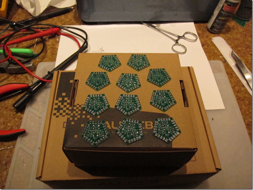
     The new boards arrived from allpcb.com. To recap, this, time I went with standard 0.1” (2.54mm”) header pins between the boards. I ordered some angled headers from the Amazon to use for the connections.

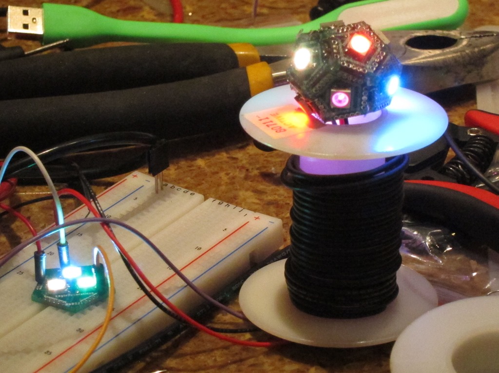
    IMG_9061

    After I populated 11 faces with LEDs, it was time for assembly. Here’s the first approach:

    IMG_9063

    The first concept was to wire the faces together with short pieces of header on the back. This worked poorly; it took a long time to hook them up and the angles were rarely right. The first half was technically done, but I was unhappy.

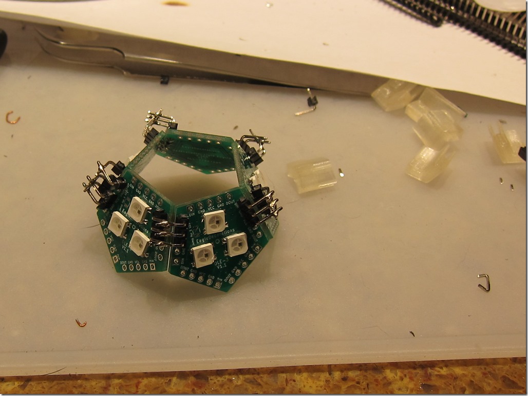
    For the second half – and keeping in mind that prettiness was not a requirement – I decided to go with another approach. I would use angled headers on the outside, and just solder the pins together where they overlapped.

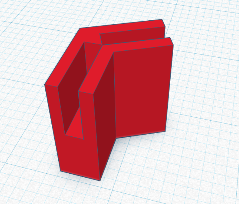
    But first, I needed a better way to set the angle. The led to the following design in TinkerCAD:

    image

    And then a long session of setup to migrate my 3D printer from an absolutely ancient laptop to one that was merely old. I printed up a whole set of these, and then used them to hold the faces at the right angle for soldering. That resulted in this upper ring:

    IMG_9068

    The alignment clips on the right worked very well; it only took about 30 minutes to do this whole ring. And yes, it’s very ugly.

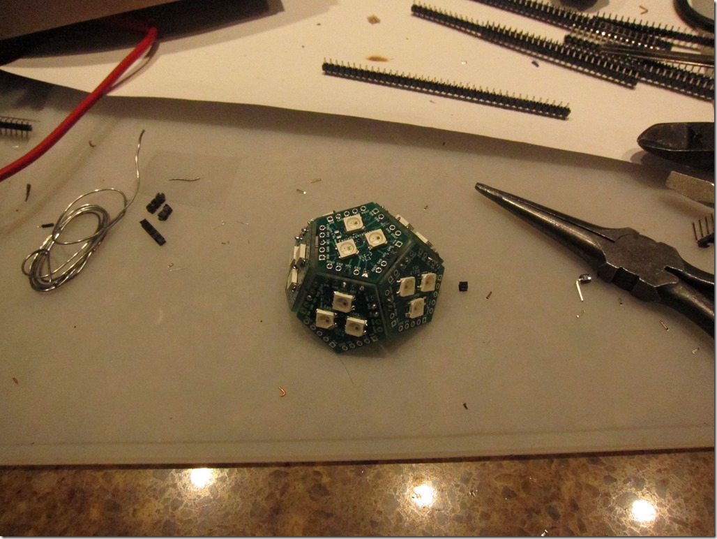
    Time to hook them together, and then attach on the end face. These are attached with small pieces of header pin on the outside.

    IMG_9069

    Then it’s time to wire up the 5 volts, ground, and data, and take it out for a spin.
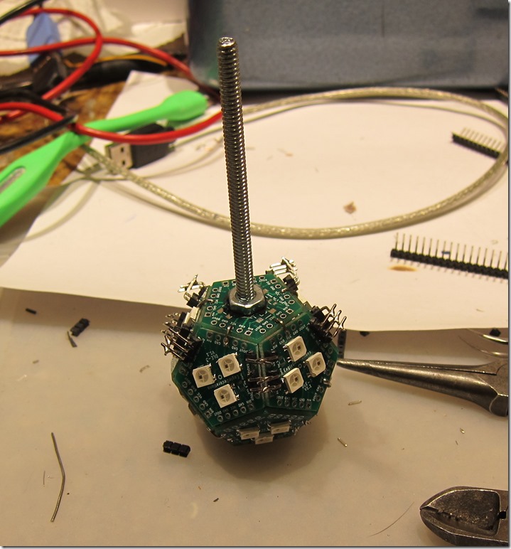
    The first attempt was not successful; one ring lit and the other didn’t. A quick check discovered that the ground connection between the two rings was not functioning, so I added an additional connection. Which led to this:
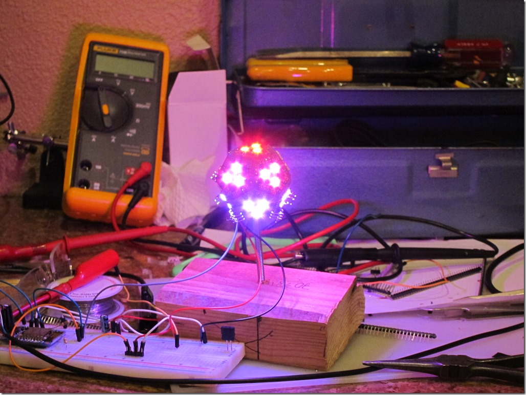
    IMG_9071

    The driver is running some simple rainbow code, so each LED is a slightly different color.

    Finally, adding on the requisite acrylic globe gives us the following:

    Globe of fire from Eric Gunnerson on Vimeo.

    Overall, I’m mostly happy. It would be nice if the header holes were a bit tighter on the pins, and I could clearly get by with 2mm or even 1.27mm pins. The 3d-printed alignment clips could use another iteration to make them easier to use.


    DLE (Globes of Fire) Pt 2

    A week or so goes by, and I get a package back from allpcb, so I started building one.

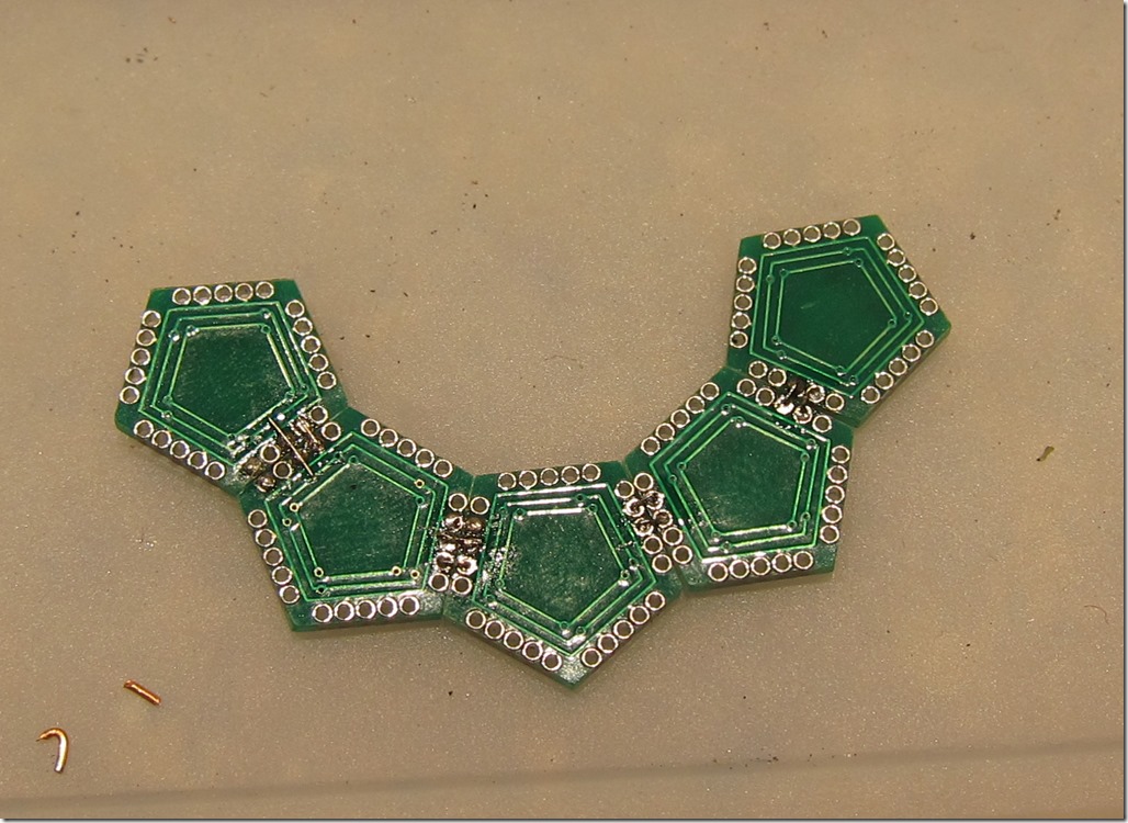
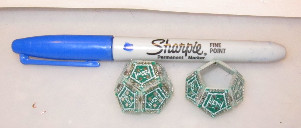
    Each half has a ring of 5 pentagons plus one the end, so I started hooking 5 boards together:

    IMG_9044

    The WS2812 LEDs are only 5mm on a side, so the whole board is roughly 15mm x 17mm. That’s tiny, and frankly working on it was a huge pain. I did this, put the boards into a box, and closed it.

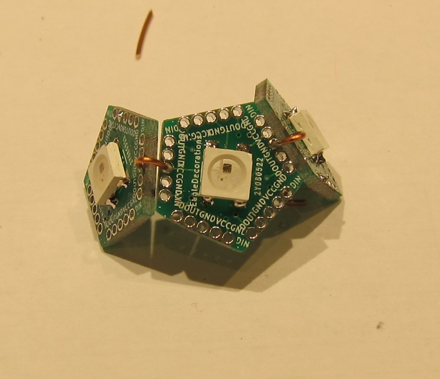
    Then I came back the next day and decided to have another try. Rather than connect on the outside, I decided to use a much lighter wire and connect on the inside (back) of the boards. Here’s a set of 5 with VCC and GND hooked up:

    IMG_9046

    Yes, that’s some *ugly* soldering, but in my defense I’d like to note that the spacing on the holes is about 0.05”/1.3mm. This then gets folded into a ring. Eventually, we end up with the top and bottom:

    IMG_9050

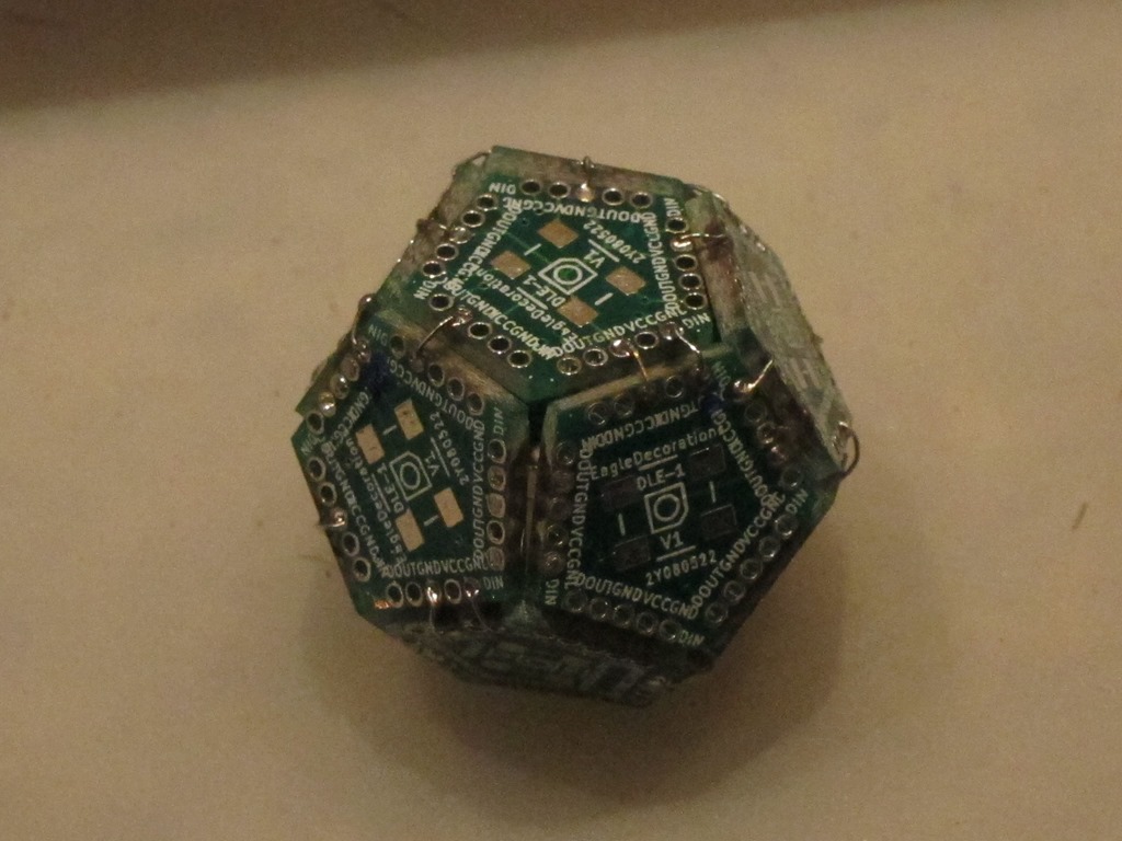
    Next, those two are soldered together with wires to carry VCC and GND between halves, and you end up with this:

    IMG_9052

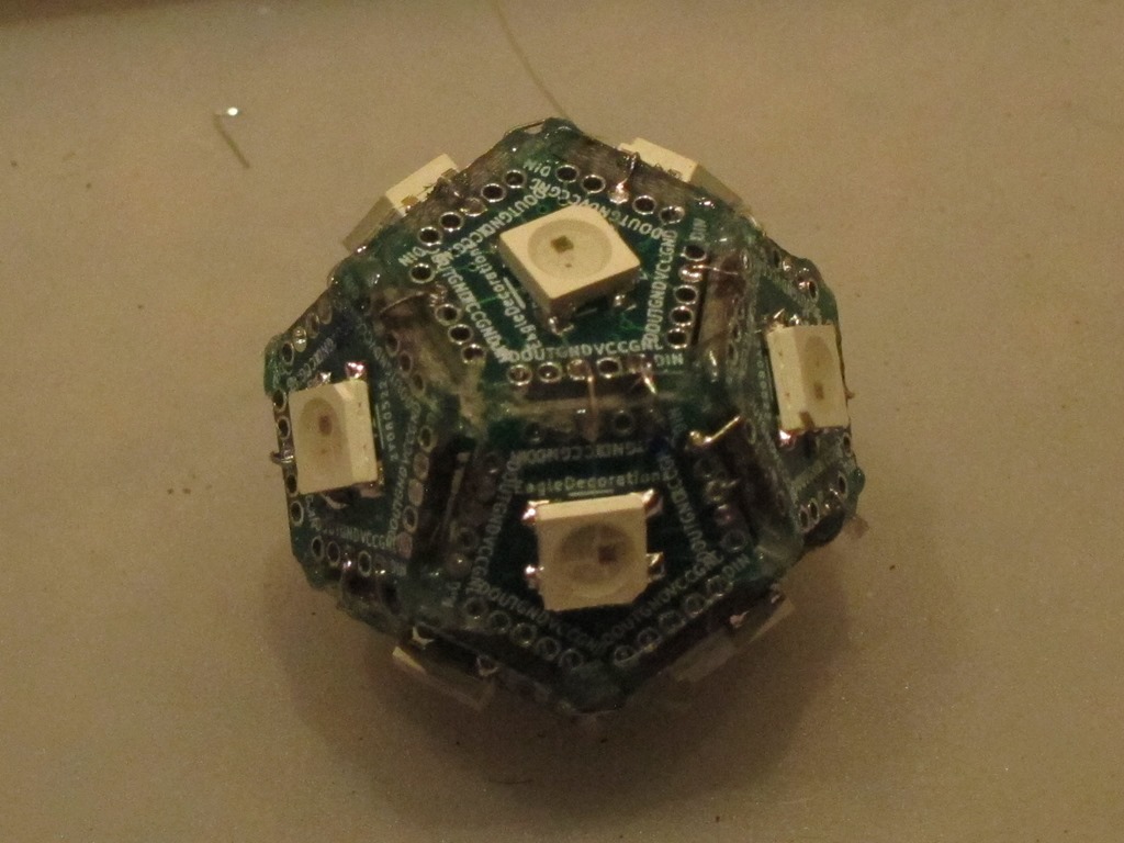
    Next was to wire through the data ports. Basically, it starts at one face at the open end, goes around that ring, goes around the lower ring, and finally travels to the bottom. Add in some hot glue to help hold things together, and put the LEDs on, and here’s the result:

    IMG_9053

    That is one ugly bit of construction, and it took a lot longer than I had hoped.

    IMG_9055

    After soldering a few hundred WS2812s, you learn how to do it without burning them up. On the left is one face from the 3-LED version that I tested to verify the layout.

    V1.1

    The first version was technically a success, but only because I so cussedly kept on. I was wondering if I could make something small enough to fit in an ornament ball, and the answer is “yes”, but you really don’t want to do it.

    So, it’s practically a failure.

    The biggest problem is the connection between the faces; the holes are too hard to solder, and using individually-cut wires is a pain…

    So, I’m going to abandon the single-LED version (kindof – more on that later) and work on the 3-LED version. I started by going with standard 0.1” (2.54mm) header spacing, and the plan is to use angled headers. The angled headers will stick out to the side, and two faces are connected by soldering the ends of the header pins together. It’s going to look a big weird, but should be a lot easier to construct.

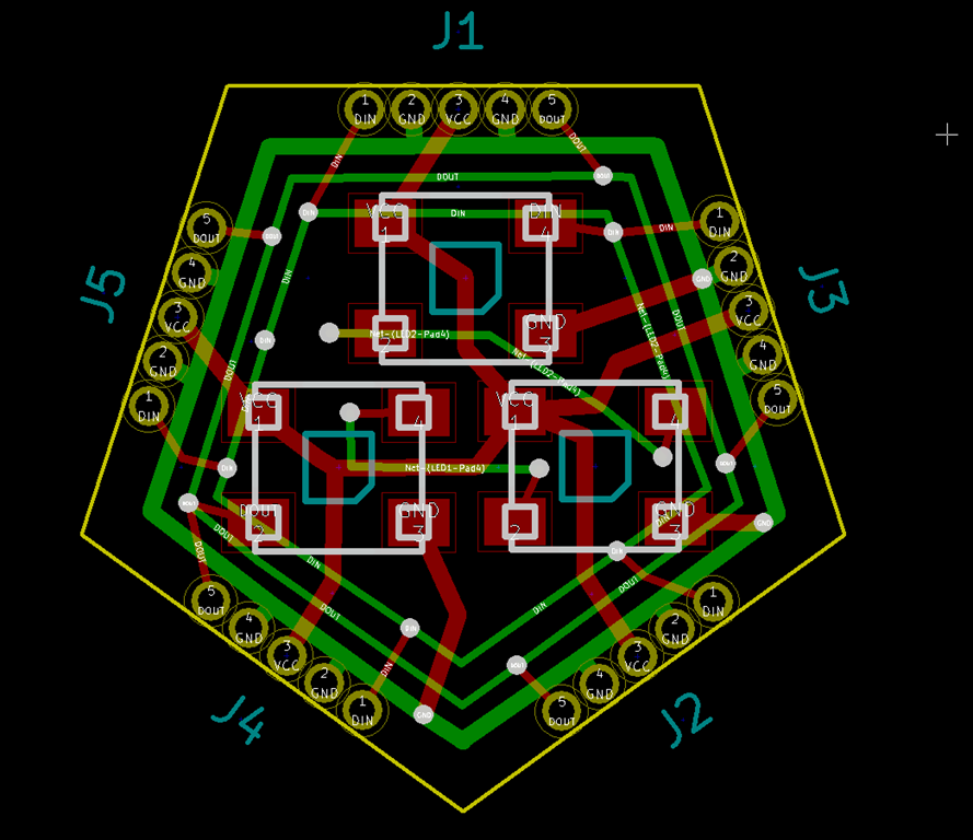
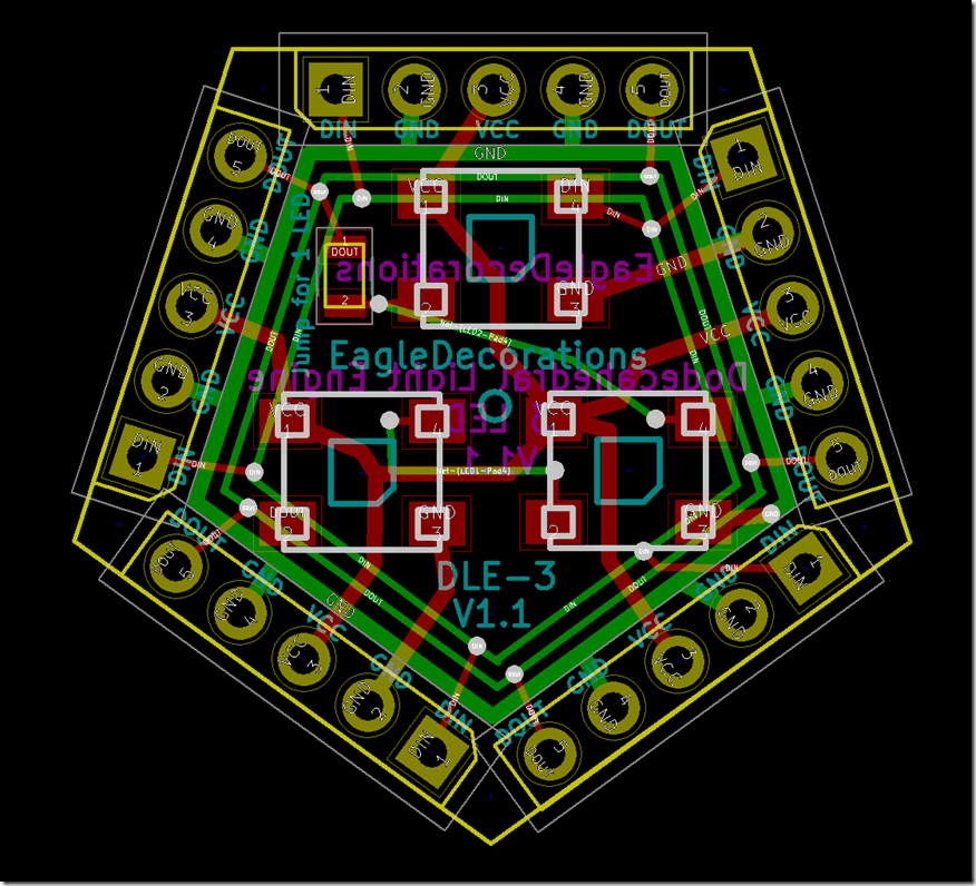
    Here’s the old design and the new one:

    image

    Obviously, the big different is the connectors; they are much larger, though the overall design is only a big bigger. I’ve used the extra space to pull the LEDs a bit farther apart because trying to hand-solder the LEDs in the first version was a difficult. And I added a little bypass jumper; if you solder a wire (or better, a 0805 zero-ohm resistor) across those pads, you can omit the bottom two LEDs and things will work fine.

    If you read backwards, you might see that it says “Dodecahedral Light Engine” on the back, which is the new name for the boards.

    A fully-populated DLE will features 33 LEDs, pull 2 amps @ 5V with everything on white, and put out quite a bit of light.

    I need one more design review pass before I send this one out to have boards made.


    Pages:1...78910111213...35